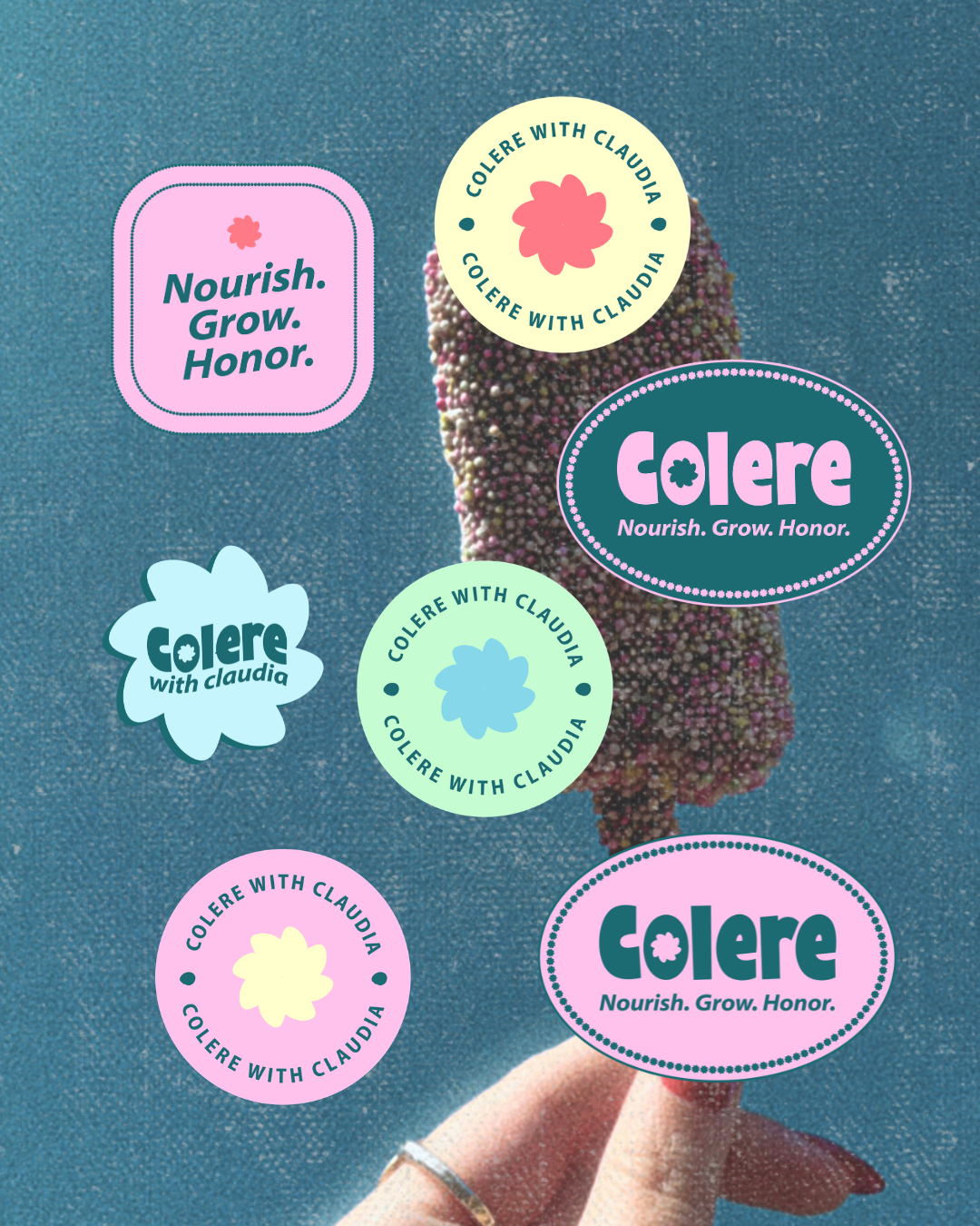
COLERE WITH CLAUDIA
Brand Identity DesignNutritional Therapy PractitionerClaudia came to me needing a brand for the launch of her nutritional therapy practice that felt playful, bold, and colorful — without tipping into "childish" territory. As a Latin teacher turned nutritional therapist, she wanted her brand name to carry real meaning: Colere, the Latin root for "to nourish, grow, and honor." She envisioned something slightly retro and nostalgic, full of color, but still polished enough to feel like a practice people would trust with their health. She kept saying to me — “more color, more color!” So that’s what we did!
LOGO MEANING:
At the center of the "o" in Colere sits a small design detail that carries the whole brand's meaning: a mark that reads as both a flower and a sun at once. The bloom-like petals nod to cultivating — tending, growing, caring for something over time — while the rounded, radiant shape echoes the warmth of a sun-drenched summer afternoon. It's a small detail, but it ties the brand's Latin roots (colere: to nourish, grow, honor) directly into something visual — a mark that feels both grounded and full of light, the same way Claudia wants her clients to feel in their own bodies.
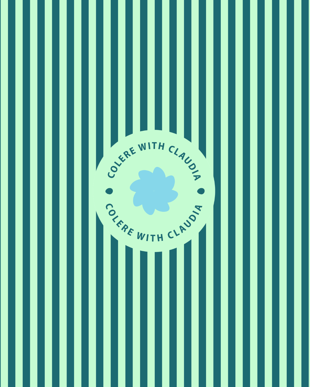
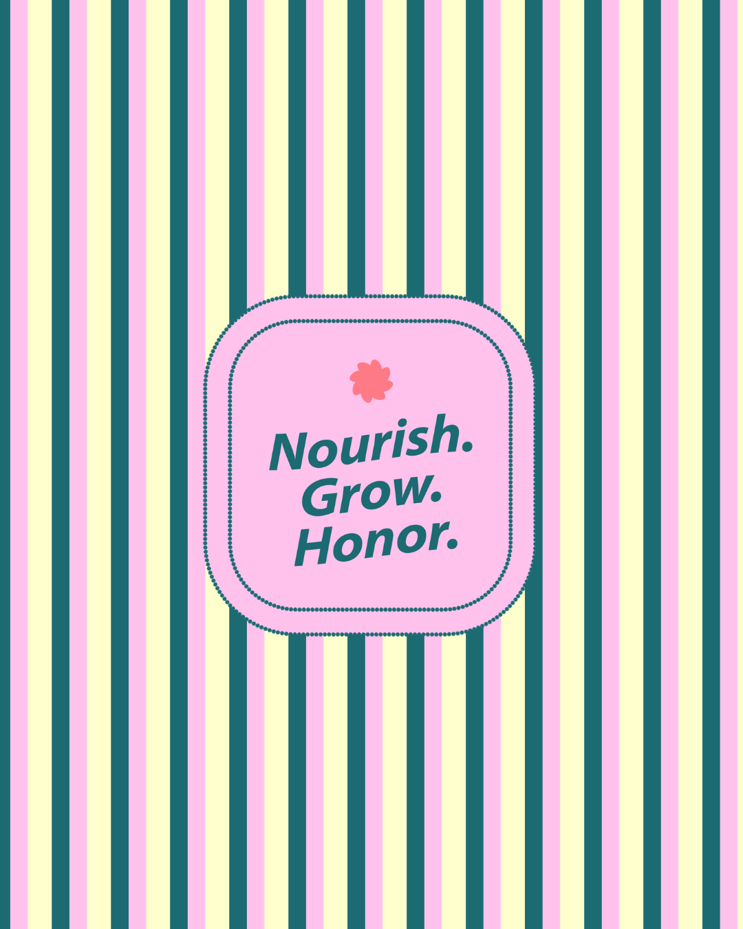
Brand patterns - similar to beach towel vibes!

The Approach:
I built the brand around a 90's-summer color story — bold color-block pinks, greens, blues, and oranges, paired with candid, sun-drenched photography (think juice-stained fingers, garden vegetables, and popsicles on a hot day). The goal was a brand that feels energetic and nourishing at the same time, like tending something you love.
The final identity includes a full logo suite — a primary wordmark plus a flower-based logomark, offered both with and without "with Claudia" — so the brand flexes cleanly across packaging, social media, and print. A custom color palette (dubbed the "Smoothie Palette," naturally) and supporting brand patterns round out a system that's cohesive but never boring.


LET’S GET BOOKED
LOVING THIS BRAND?This is what happens when a brand is built with intention — not a template, not a guess, but something designed to feel unmistakably you. If you're ready for a brand that finally matches the business you're building, I'd love to help. Let's create something worth falling for.