
Marigold & Moss
Conceptual brand identity for a botanical apothecary and plant shop
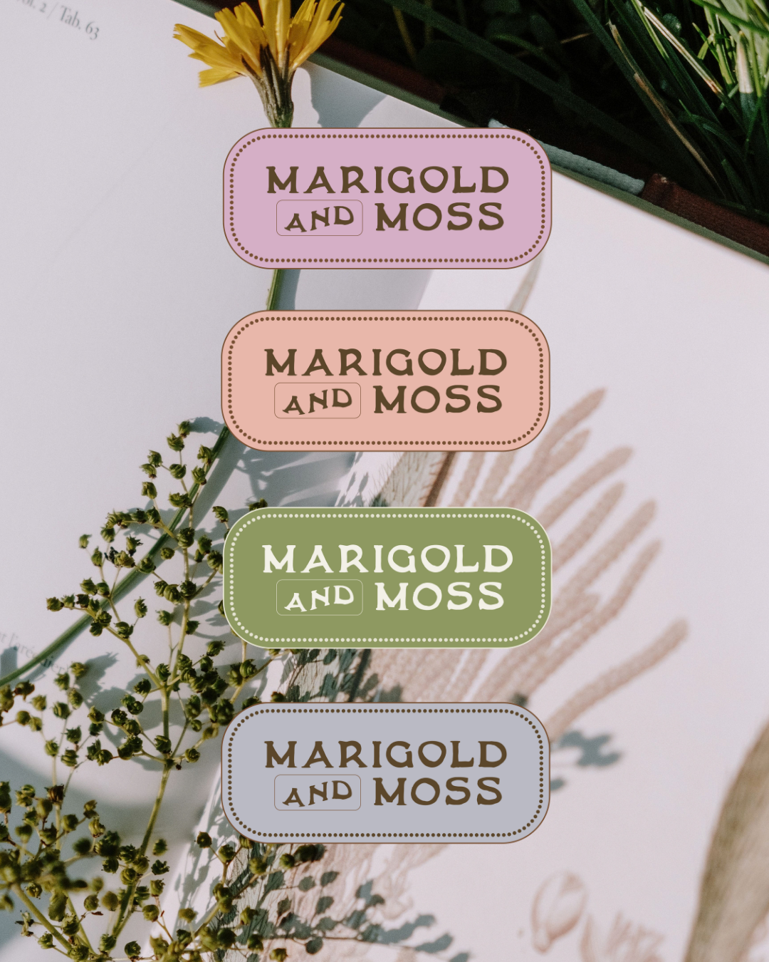

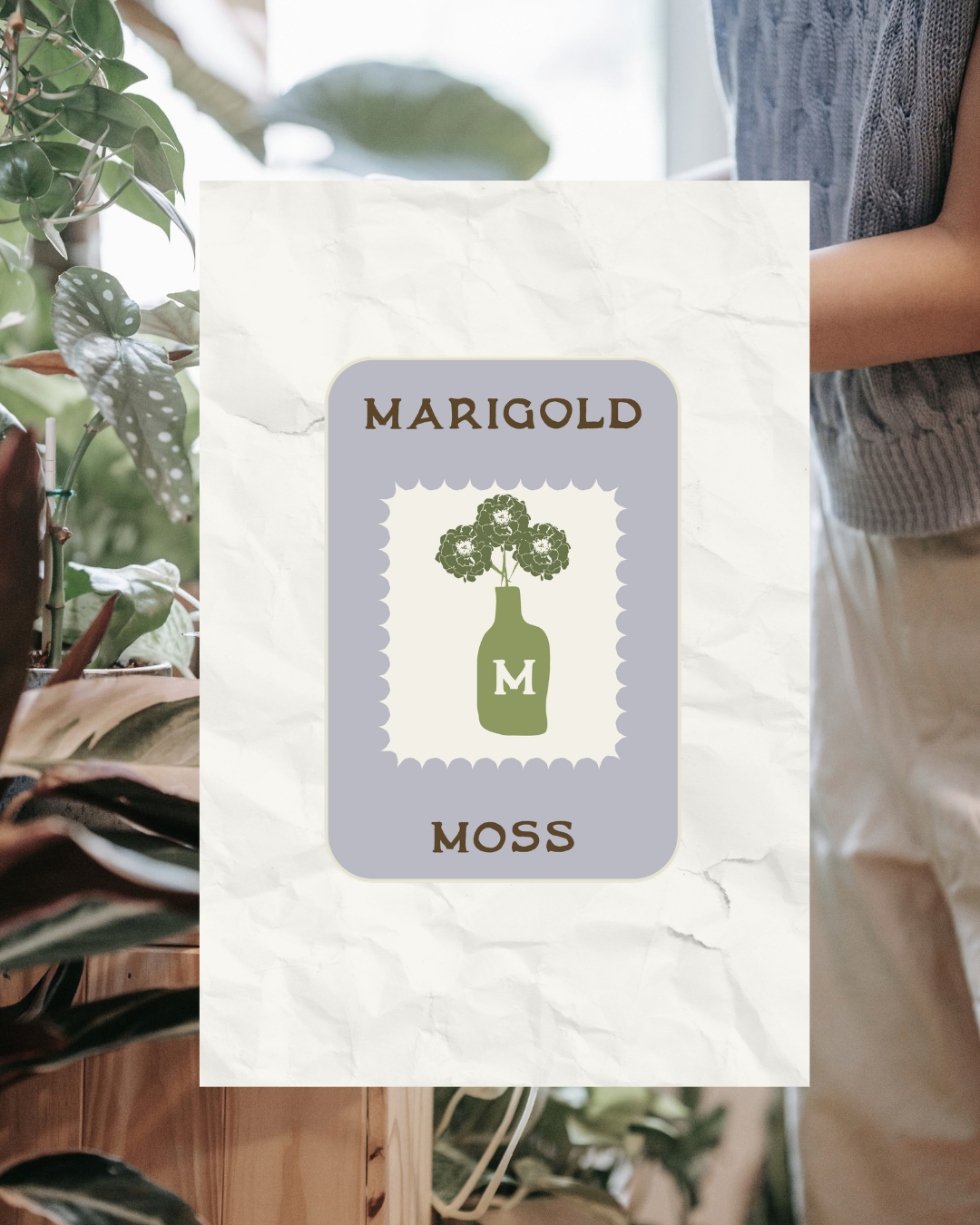
Marigold & Moss started as a design challenge brief: create a brand for a fictional botanical apothecary and plant shop that feels earthy, a little WORN, and tactile. I treated it like a real client project, building a full identity from the name up.
MARIGOLD & MOSS
The idea
I wanted the brand to feel like a shop you’d find tucked away on a quiet street, with shelves of plants, old glass jars, and hand-labeled bottles. The look borrows from vintage botanical illustration and old apothecary labels, but stays fresh and approachable instead of dusty. It’s a little mysterious and a lot welcoming.
What I created
Badge mark: the primary emblem, designed to work on signage, labels, and packaging
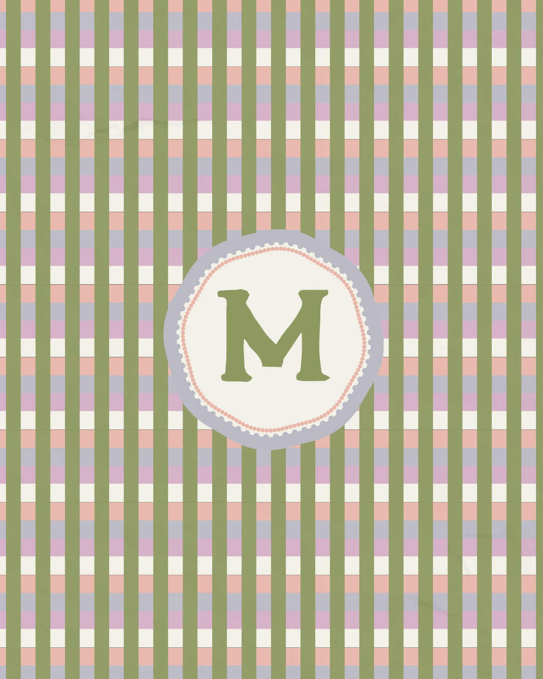
Monogram seal with an “Est. ‘26” detail: a small touch that gives the shop instant heritage
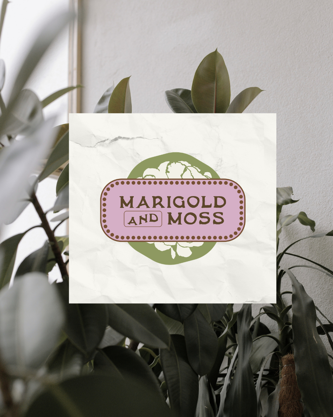
Wordmark lockup: a flexible logo for web, print, and merchandise
Color palette: Golden Keys, Dusty White, Fresh Lilac, Antique Mauve, Garden Green, Leafy Green, and Soft Coral
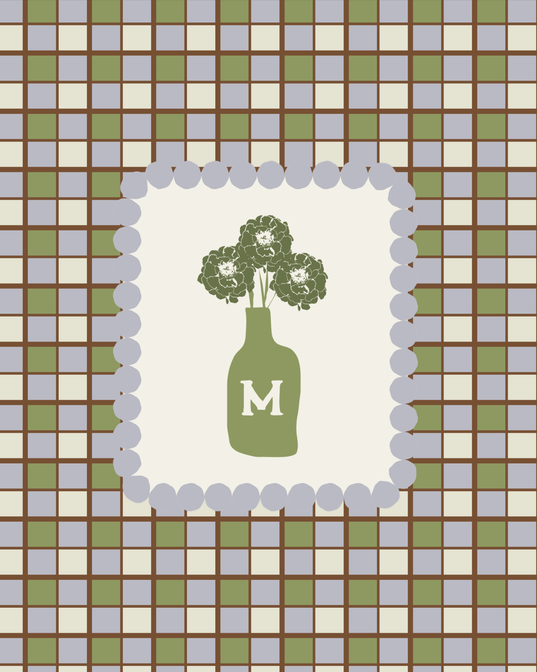
Typography and patterns: Details that bring the brand all together
The palette
The colors balance warm and cool. Golden Keys and Soft Coral bring sunlight and a hint of marigold, while the greens ground the brand in plants. Lilac and mauve add the apothecary, slightly mystical feel, and Dusty White keeps everything soft and readable.
Where it could live
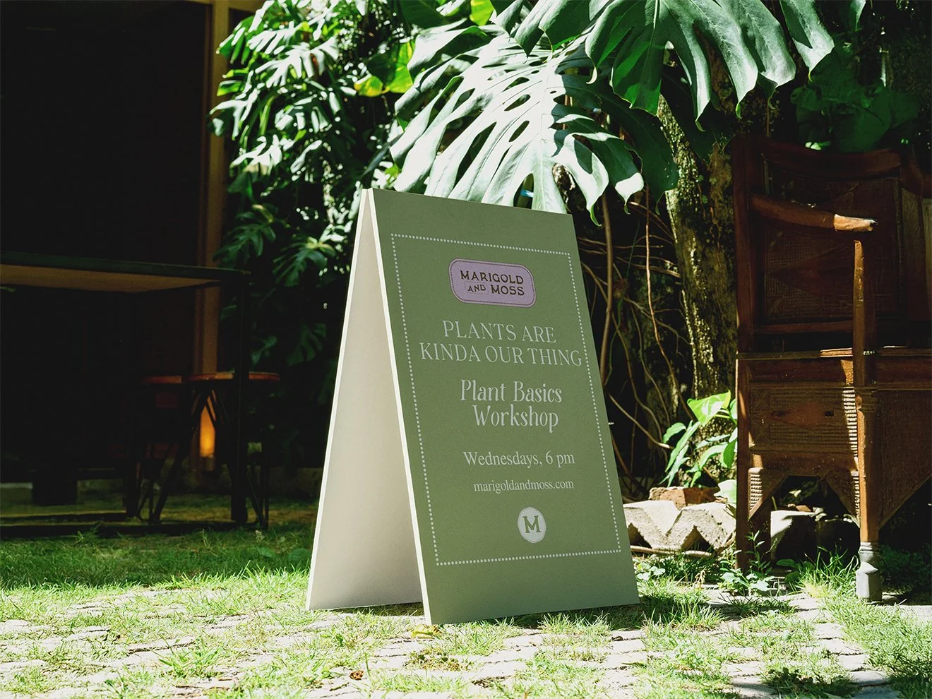
This brand is built to flex across a shop sign, plant tags, apothecary-style labels, packaging, a website, and social media.
Want a brand like this?
If you love this vintage, botanical, tactile feel for your own business, I’d love to create something similar for you.